What if every report, plan or document you write could automatically look like it was professionally laid out?
By learning just one technique, you can make your documents look smart, on-brand and clear – and consequently be more communicative and persuasive – all without taking any extra time.
Below, I’m going to tell you the single most important thing you’ll ever read about how to use Microsoft Word. But first we need to mention two fundamental points, without which even the cleverest tricks are of no use.
First things first

Visual consistency is key to professionalism
The specific fonts, colours and layouts that you or your brand favours aren’t ultimately that important. What’s important is that you stick to them.
If your brand font is Arial, don’t change it. If your brand headings are blue at 18pt, always set them in blue at 18pt. In short, when it comes to writing your document, you shouldn’t be designing it too. Those design decisions should already have been made (whether by you or someone else).
If it sounds like hard work to remember the correct fonts and colours for each part of the document, and apply them each time, you’d be right: that’s where the technique below comes in. But first, we need to say a word about the text itself.
Clarity of writing follows clarity of thought
No amount of design can make a poorly-written, badly-structured document any more effective.
Always start by thinking how your content breaks down into logical sections and sub-sections. Now it will be clear where you need to add these headings, sub-headings, bullets, and so on. Keep doing this as you write.
Remember that a good piece of text will be a “coherent whole, a series of paragraphs that follow logically in order and, ideally, will suffer if even one sentence should be cut out.”1 Plain and succinct writing is the best way to get your meaning across.
Styles: the single most important technique in Word

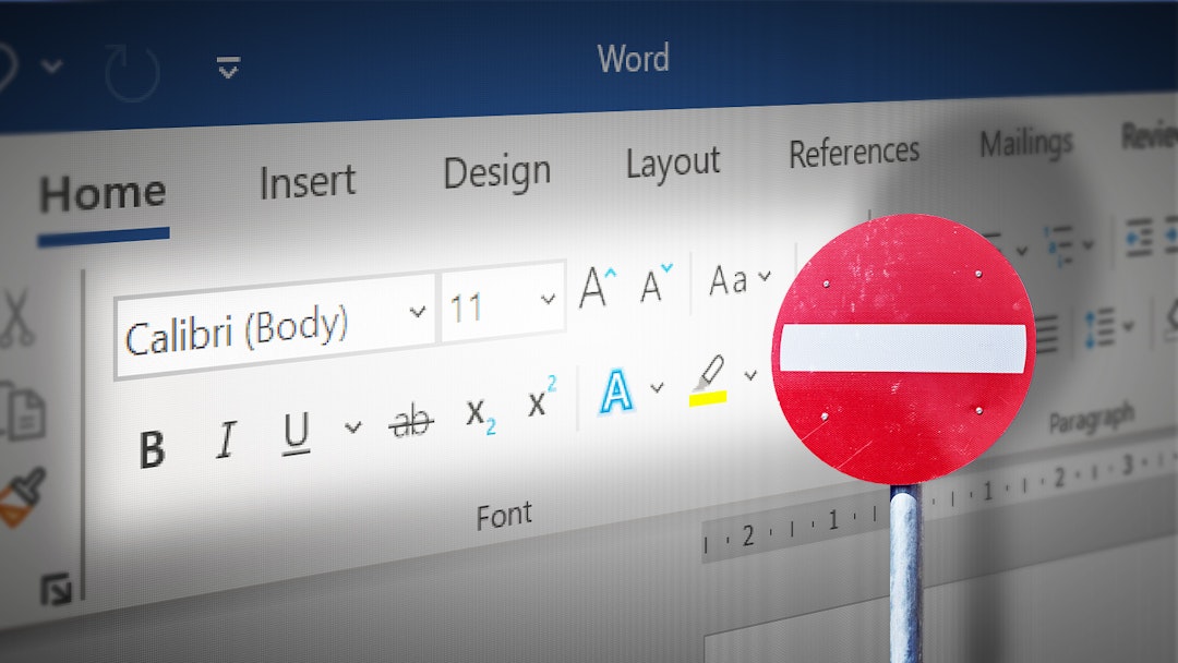
See those buttons for font, size, bold, colour, underline? Never touch them again.
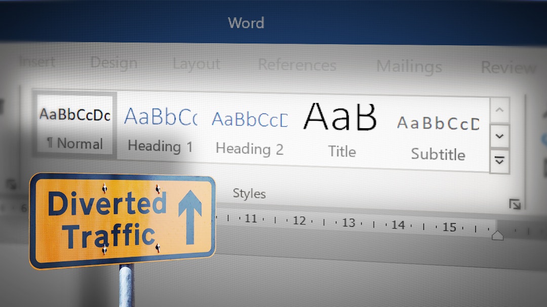
Instead, to apply formatting to your document, the only buttons you should click are the Style buttons, a bit to the right. These are like shortcuts for applying many predefined font and colour settings all at once.

For instance, the “Heading 2” button – which is used for second-level headings (i.e. sub-headings) – might be set as a shortcut for “Bold, 16pt, Blue”. It applies all three in one click.
Crucially, what this means is that all your sub-headings can now look the same, without even thinking about it.
The formatting that each Style button applies is determined by the template you’re using.
So, in one template, Heading 2 is “Bold, 16pt, Blue”, while in another it could be set to “Underlined, All-Caps, Red”.
All Word documents are based on a template, whether it’s the default “Normal” template (with Styles from Microsoft) or one you specifically selected. Choosing a template is essentially to choose a set of formatting Styles.
So, if formatting comes from your Styles, and your Styles come from your template, then this is where the ‘design’ should actually happen.
Templates determine design, and multiply it
You should use a template that’s been set up with Styles to match your brand and the kinds of documents you need to write.
Any time spent setting up a template will in turn be saved, again and again, every time you start a document based on it.
- If you don’t have a brand template, create one. To do this yourself, simply open a new document and edit its Styles (right-click each Style button and select Modify). Set each to the formatting you want, then Save As a template file (.dotx).
- If you already have a brand template, you should always use it. A new document can be created from a specific template in several ways, including just double-clicking the template file.
Once you have a template file, if you want, you can overwrite Word’s default ‘Normal’ template with it. If you do that, then simply opening Word will automatically load your template, and all the Style buttons will have your formatting settings ready.
Use Styles for effortless style
Learning to use the Style buttons instead of the ‘manual’ formatting buttons lets you create visually consistent documents faster.
It means you can completely put out of your mind how the document looks, and instead think only about what to write and how it should be structured. It’s actually even less effort – and with a better result.
-
Style Guide (10th Edition), The Economist. ↩
Is there more you’d like to know about using Word professionally? Did you already use Styles or is the idea new to you? Let’s talk further on one of the networks below, where we also posted this article.
While you're there, drop a Like or Share if this was useful so we know to write more like it in future.
If you’d like us to design and set up a brand template for you, just get in touch. We can also train your team to create clearer documents that better communicate their ideas.

 LinkedIn
 Facebook
 Twitter
 Medium