

Information Organisation Brand
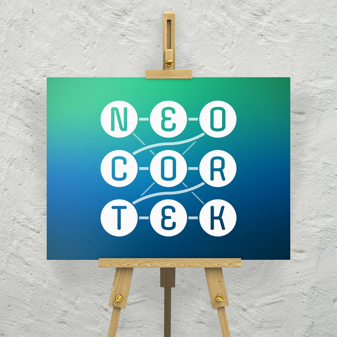
The Neocortek brand revolves around a motif of connections between dots, set against a futuristic gradient suggestive of smart technology. Neocortek’s tagline is indeed “connecting the dots”: they help professionals manage their information and relationships.
The logo was designed with two forms: a square (primary) version, which can also “unfold” into a horizontal version. It was also provided in positive and negative variations.
As part of the branding process we also created a presentation template and a business card design.
Key Services
Branding
Your brand is the centre of our marketing universe.

